- 08 March 2025

Even if your brand, website, or banner ads are stunning, you may still not be able to generate sales. Visuals are created for "style," not results, which is a common mistake. Even if you've spent thousands of dollars on design, customers won't remember, see the purpose, and purchase. Here are seven indicators that your image is decreasing rather than increasing conversions. Each point is not just an aesthetic mistake, but a specific reason why customers are leaving.
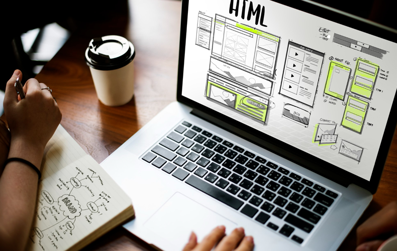
1.Your design is “just pretty” - without a specific purpose
Visuals for many projects are made because "we like it" or "to make it pretty." However, a design that serves no purpose is merely an image. It lacks logic, a purpose, and any advantages for the user. The customer may be visually appealing, but he is unsure of what to do next—click, read, or purchase?
Every visual component is ballast if it serves no purpose, such as directing, highlighting, or selling. A good image functions as a navigator by directing the viewer's gaze, indicating the next action, and highlighting the key point. Any icon, color, or illustration should serve as a tool rather than a decorative element. You lose sales and merely colorize the website without it.
2. Visual is overloaded - too much detail, noise, complexity
The user's attention is dispersed when a banner or page has too many elements. Lots of text, lots of icons, unnecessary decorative blocks - all this reduces perception and causes fatigue. One of the biggest obstacles to conversion is visual noise.
The user expends energy figuring out the interface rather than making a choice. This lessens the possibility of an application or click. The visual hierarchy principle—one main focus on the screen, few distracting details, lots of "air," and contrast—is the answer. The impact of the important is greater when it is less superfluous.
3.No focus on Call to Action - buttons get lost, call to action is not visible
This error is frequently found even in costly landing pages: the buttons are made "in color," and the call is either too small or unreadable. As a result, the user leaves because they are unsure of where to click. The conversion rate is cut in half when there is no obvious visual focus.
The element that is most visible on the screen should be the call to action, or CTA. Text: specific ("Get an estimate," "Download PDF," "Book a call"), color: contrasting. Additionally, it ought to be in the visibility area rather than the footer or after three text screens. When the button is visible and you want to press it, that's a good visual.
4.No visual structure: everything looks the same and is not readable
The structure is lost when every block on the website or banner has the same visual appeal. The user is unable to distinguish between the main and secondary, as well as where the beginning and end are. Such content appears as boring cards or a solid wall of text.
Visual hierarchy is the answer. Use size, color, and indentation to draw attention to important ideas. Make use of contrast by using large headlines, accent words, and various background blocks. One idea, one screen. Repetition is fine, but avoid making the user "drown" in a homogenous gray mass.
5.Visual without emotion: everything is clean, even, sterile - but it doesn't catch on
The design can occasionally seem so well-executed that it lacks vitality. Standard illustrations, neutral colors, and flawless grids all give the impression of being "professional" but utterly impersonal. This type of visual doesn't evoke a sense of trust, leave an impression, or compel interaction.
Incorporate a feeling. It can be: a photo of the team, a phrase that speaks the language of the client, a lively icon, an accent color. Don't be afraid to “break the perfect” if it makes the design human. The image should convey that people buy from people.
6.Stock or outdated images are used
You can tell if you're using images from Shutterstock or Unsplash's front pages. Stock destroys individuality and credibility. The client recognizes right away that there is no actual business, no actual people, and no actual experience here.
Using actual photographs, or at the very least, unique illustrations that fit your style, is the answer. Even a simple office and staff photo shoot will yield ten to fifteen original images that will help you stand out from the competition. Recall that authenticity, not the template, is what sells these days.
7.Visuals are not customized to your target audience
It's a disaster if you have a lifestyle influencer-inspired design and you're offering services to business owners. If your website has animations and icons that look like they belong on a kid's app and you're creating a business-to-business product, that will hinder rather than assist.
Design is a language. Your audience should be accustomed to it and feel at ease. Examine her visual preferences, including the websites and brands she respects. Create your images using your client's language, not your personal preferences. You can only hit the target in that manner.
Additional signs that visuals are getting in the way of selling:
there are no variations in the style or color of banners across campaigns;
the pitch lacks logic because the social media, lending, and banners appear to be from different universes;
the brand positioning is not reflected in the images;
on mobile devices, fonts are difficult to read;
there is no hierarchy; all screens are "equally important";
case studies, client logos, testimonies, and before/after pictures are examples of non-visual proof;
It's time to change the way you view visuals if you discover that you exhibit at least two or three of these symptoms.
Self-diagnosis: visual checklist
Mark off the things that are unquestionably related to your project:
every screen has a clear and visible call to action;
the image serves a purpose, whether it be to direct, highlight, or sell;
one idea, one screen;
pictures are authentic, not stock;
fonts and colors are readable on mobile devices;
testimonials, logos, and photographs provide visual evidence;
the target audience is emotionally affected by the image.
You need to work on something if you checked fewer than five points. Visuals are a component of the sales funnel, not just decoration.
Conclusion
"Ugly" isn't the same as bad visuals. It has to do with inefficiency. Growth is impeded when your banners, website, or brand fail to inspire trust, persuade, or guide.
On the other hand, effective visuals enhance. It enables you to comprehend, desire, and act more quickly. Additionally, begin by examining the visual if you're at the point where "something doesn't work, but it's not clear what." Additionally, don't be scared to make changes gradually rather than all at once:
one clear banner
updating the CTA style
real-time images rather than stock
organization within the landing page's blocks
unified communication style
If images are made to be clear and convincing rather than "beautiful," they can sell.